Read this before you book
Common Chinese Tattoo Mistakes and How to Avoid Them
Native Chinese speakers see the same tattoo mistakes again and again. The good news: almost all of them are easy to avoid if you know what to check. Here is the list.
 Save to Pinterest
A Chinese tattoo rarely goes wrong because someone chose a bad word. It goes wrong somewhere between the idea and the skin: a translation app picks the wrong sense of a word, a design mixes two writing systems, a stencil gets flipped, or a stroke goes missing when a character is copied by eye.
None of these mistakes needs fluent Chinese to avoid. You just need to know where to look. Below are the seven most common problems, with real examples, and a short checklist to take to your appointment.
1. Trusting a translation app or a one-line dictionary result
Translation tools give you the most common translation of a word. They don't know you want a tattoo, and English words often have several senses. The result can be a real Chinese word that means something you didn't intend. Some examples a native speaker sees:
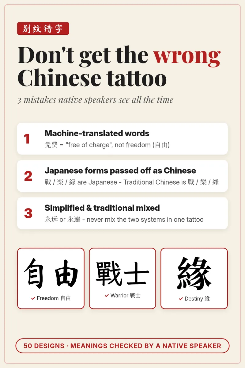
- “Free” → 免费 (miǎnfèi). This means free of charge, as in a free sample. The word for freedom is 自由 (zìyóu). People really do end up with this tattoo error.
- “Peace” → 和平 (hépíng). This is peace between nations, world peace. For inner peace, being safe and well, the natural word is 平安 (píng'ān).
- “Strength” → 强度 (qiángdù). Dictionary look-ups can return this, but it means intensity, or the strength of a material: an engineering word. The tattoo word is 力 (lì).
- “Faith” or “believe” → 信仰 (xìnyǎng). Machine translation sometimes gives this, but it means a religious creed. For faith as inner conviction, Chinese uses 信念 (xìnniàn); for “believe”, 相信 (xiāngxìn).
- “Blessed” → 祝福 (zhùfú). This means giving a blessing or best wishes, like a greeting card. 感恩 (gǎn'ēn), gratitude, is closer to the feeling.
- “Hope” → 期望 (qīwàng). Machine translations sometimes give this. It is more like “expectations placed on you”. The positive, everyday word is 希望 (xīwàng).
Phrases are even riskier. “Let it be” or “carpe diem” translated word by word produce sentences that are odd or meaningless in Chinese. Chinese has its own established expressions for these ideas: 顺其自然 (“follow its natural course”) and 活在当下 (“live in the present moment”).
How to avoid it: start from a meaning, not a word. Describe what you want the tattoo to say, then find the Chinese word a native speaker uses for that idea. Before you commit, have someone who reads Chinese confirm it.
2. Mixing simplified and traditional characters
 Save to Pinterest
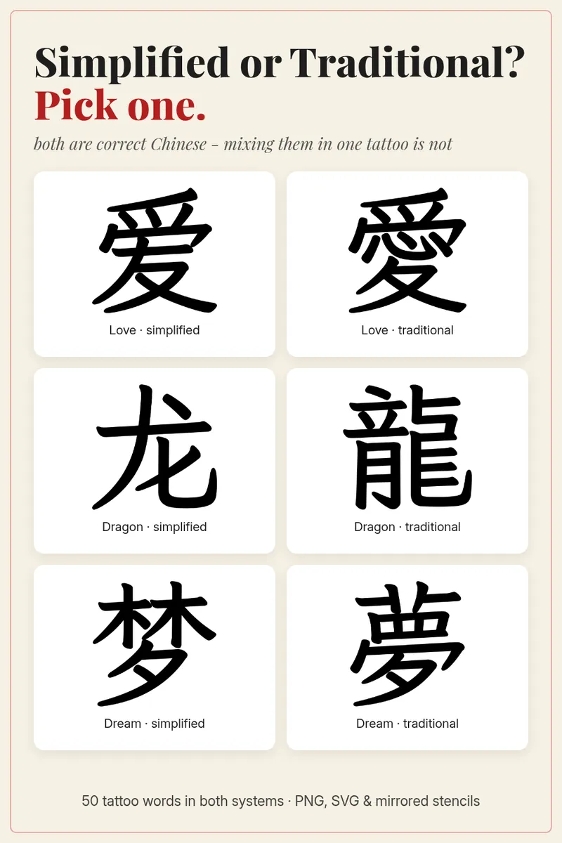
Chinese has two standard writing systems. Simplified characters were introduced in mainland China in the 1950s and 1960s and are used there and in Singapore. Traditional characters are used in Taiwan, Hong Kong and Macau. Both are completely correct.
The mistake is mixing them. It's like spelling one word in British English and the next in American English, except more visible. Many characters are the same in both systems, so mixing usually happens by accident: someone copies one character from one website and the next from another.
Some pairs look completely different:
- Love: 爱 vs 愛 (the traditional form keeps the heart 心)
- Dragon: 龙 vs 龍
- Dream: 梦 vs 夢
- Never give up: 永不放弃 vs 永不放棄 (only the last character changes)
- Live in the moment: 活在当下 vs 活在當下
How to avoid it: decide on one system first, then check every character of the design against that system. Traditional feels more ornate; simplified is cleaner and reads well at small sizes. Either is fine.
3. Japanese forms presented as Chinese
Japanese kanji developed from Chinese characters, and many are identical. But Japan standardized its own simplified shapes for a number of characters, and some Japanese forms differ from both simplified and traditional Chinese. A design sold as “Chinese” is sometimes actually Japanese:
- Warrior: traditional Chinese 戰士, but Japanese writes 戦. And 武士 is the Japanese “samurai” word.
- Joy: traditional Chinese 樂, Japanese 楽.
- Destiny: traditional Chinese 緣, Japanese 縁.
- Dragon: Chinese 龍 / 龙. Japanese sometimes uses 竜.
- Serenity: traditional Chinese 寧靜, Japanese writes 静.
- Soul: traditional Chinese 靈魂, Japanese 霊魂.
- Honor: traditional Chinese 榮譽, Japanese 栄誉.
A Japanese tattoo is a perfectly good choice if that is what you want. The problem is getting one when you thought you were getting Chinese.
4. Look-alike characters: one stroke, a different word
Chinese characters are built from parts, and many characters differ by a single dot or line. Copied by eye, by someone who doesn't read Chinese, they can easily become a different character, or no character at all:
- 力 (strength) drawn as 刀 (knife) or 九 (nine).
- 福 (fortune): the left side must be 礻 (spirit/altar), not 衤 (clothing). One extra dot turns it into a non-character.
- 自由 (freedom): in 由 the vertical stroke pokes out the top. In 甲 it pokes out the bottom, and 田 has neither.
- 幸 (fortunate) vs 辛 (bitter, hardship). Mixing them flips the meaning of 幸福 (happiness).
- 士 (scholar/soldier, with a longer top line) vs 土 (earth, with a longer bottom line).
- 妹 (younger sister) uses 未, where the upper line is shorter, not 末.
- 永 (forever) vs 水 (water). 永 has a dot on top.
- 虎 (tiger) vs 虚 (empty, void). Only the bottom differs, and the meaning is the opposite of strong.
How to avoid it: never let anyone redraw the characters freehand. Give your artist a clean digital file, ideally a vector (SVG) or high-resolution PNG, and ask them to trace it exactly.
5. Mirrored or upside-down characters
Most tattoo stencils are printed and transferred onto the skin. Depending on the artist's method, the design may need to be printed mirrored so it ends up the right way round. Get that step wrong, and a character can end up flipped. To a Chinese reader, a mirrored character is as obviously wrong as backwards English.
There is also a special case: 福. Chinese households often hang 福 upside down at New Year as a pun, because “upside down” and “arrived” sound alike, so it reads as “fortune has arrived”. That's a decoration custom. Don't tattoo 福 upside down.
How to avoid it: before the needle touches your skin, look at the stencil in a mirror and compare it with the original file. Ask your artist whether their method needs the normal or the mirrored file.
6. Spacing, fonts and broken characters
Some characters are made of two parts that sit side by side or one on top of the other. If the parts are spaced too far apart, a Chinese reader sees two separate characters:
- 耐 (in 耐心, patience) is 而 + 寸 packed into one character.
- 忠 (loyalty) is 中 sitting on 心, one character, top and bottom.
Fonts can cause trouble too. Some fonts draw older or regional variants of a character, like the rare old form 眞 for 真 (truth). Decorative “Chinese-style” fonts made for English letters are no help at all. If the characters come from a font, make sure it is a proper Chinese font with standard forms.
7. Pinyin and pronunciation slips
If you add pinyin under the characters, or simply want to say your tattoo correctly, watch the details. Tone marks are part of the spelling. Some characters change their reading with the word:
- 平安 is píng'ān. It needs the apostrophe, otherwise it could be misread as “pin gan”.
- In 浴火重生, 重 is chóng (again), not zhòng (heavy).
- In 乐 (joy) the reading is lè. The same character reads yuè when it means music.
- In 永不放弃, the dictionary spelling is bù, but in speech it changes to bú before a fourth tone.
A quick checklist before your appointment
- I started from the meaning I want, not from a translation app.
- I know whether my design is simplified or traditional, and every character matches.
- The forms are Chinese, not Japanese (unless I want Japanese).
- I have a clean digital file. My artist will trace it, not redraw it.
- The stencil on my skin is not mirrored or upside down.
- Multi-part characters are not split apart.
- Someone who reads Chinese has looked at the final design.
For the meaning of every word in this collection, see 50 Chinese Character Tattoos and Their Real Meanings. For theme ideas, see Chinese Tattoo Ideas for Love, Strength and Peace.
The 50-design pack was made to avoid exactly these mistakes. You get simplified and traditional forms that are never mixed, standard Chinese shapes, pinyin with correct tones, normal and mirrored stencil files, and a “common mistake” note for every word.